0
  • Hobbiton / AKU Collective
  • 2018

Isometric illustrations & Icons for log cabin website

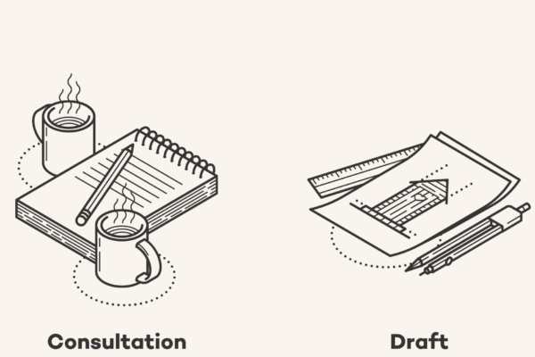
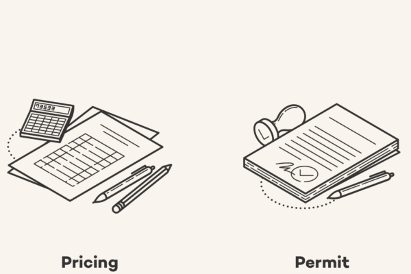
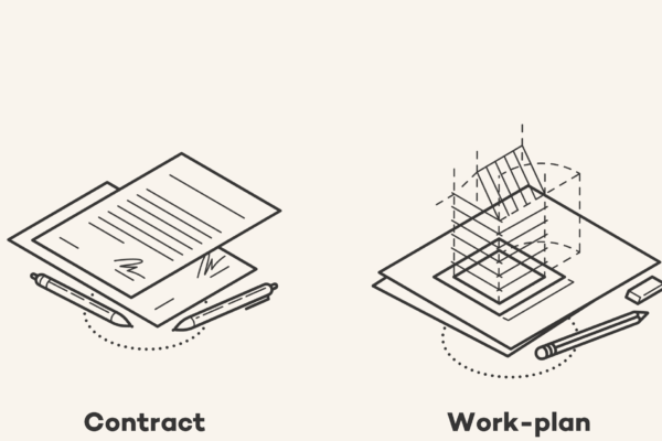
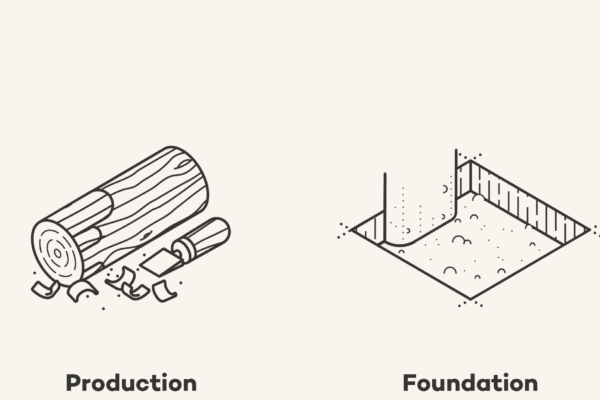
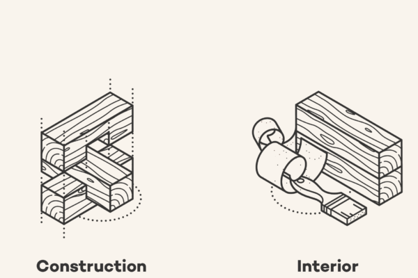
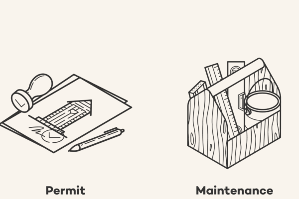
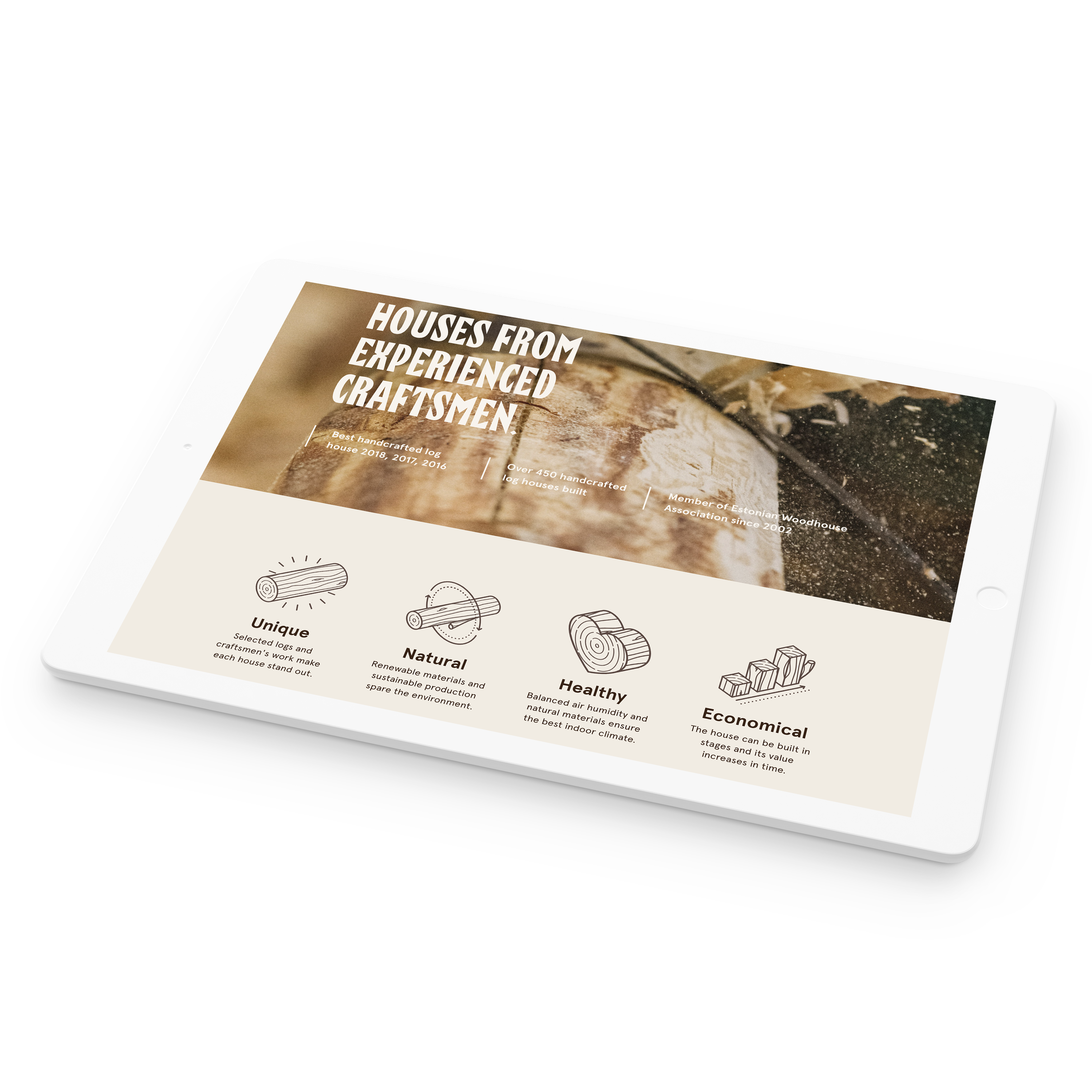
Hobbiton makes handcrafted log houses from experienced craftsmen and I was hired to make icons and illustrations to drive home the custom feel of the housing. A monoline stroke style was used, in combination with a wood pattern and isometric point of view to create a set of unique icons describing the service they are offering and the benefits of the product. All of the assets were sketched out and confirmed with the client every step of the way and the icons made a good coherent set any brand could be proud of.
I had the pleasure of working together with AKU design agency, who designed the page – you can find them here https://aku.co/
And you can find the illustrations live here: https://hobbiton.ee/en/

The houses

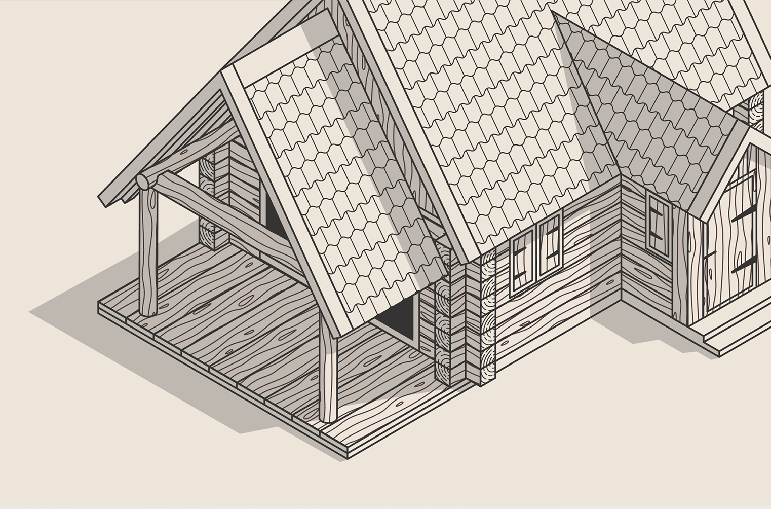
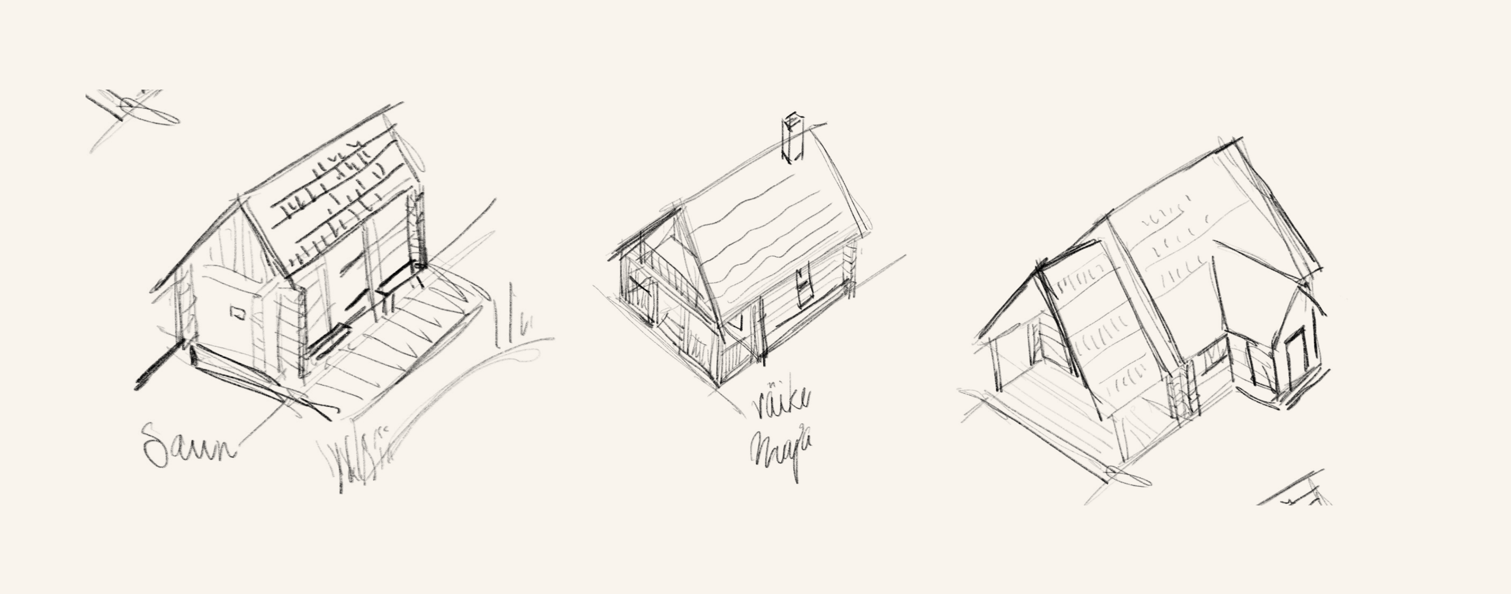
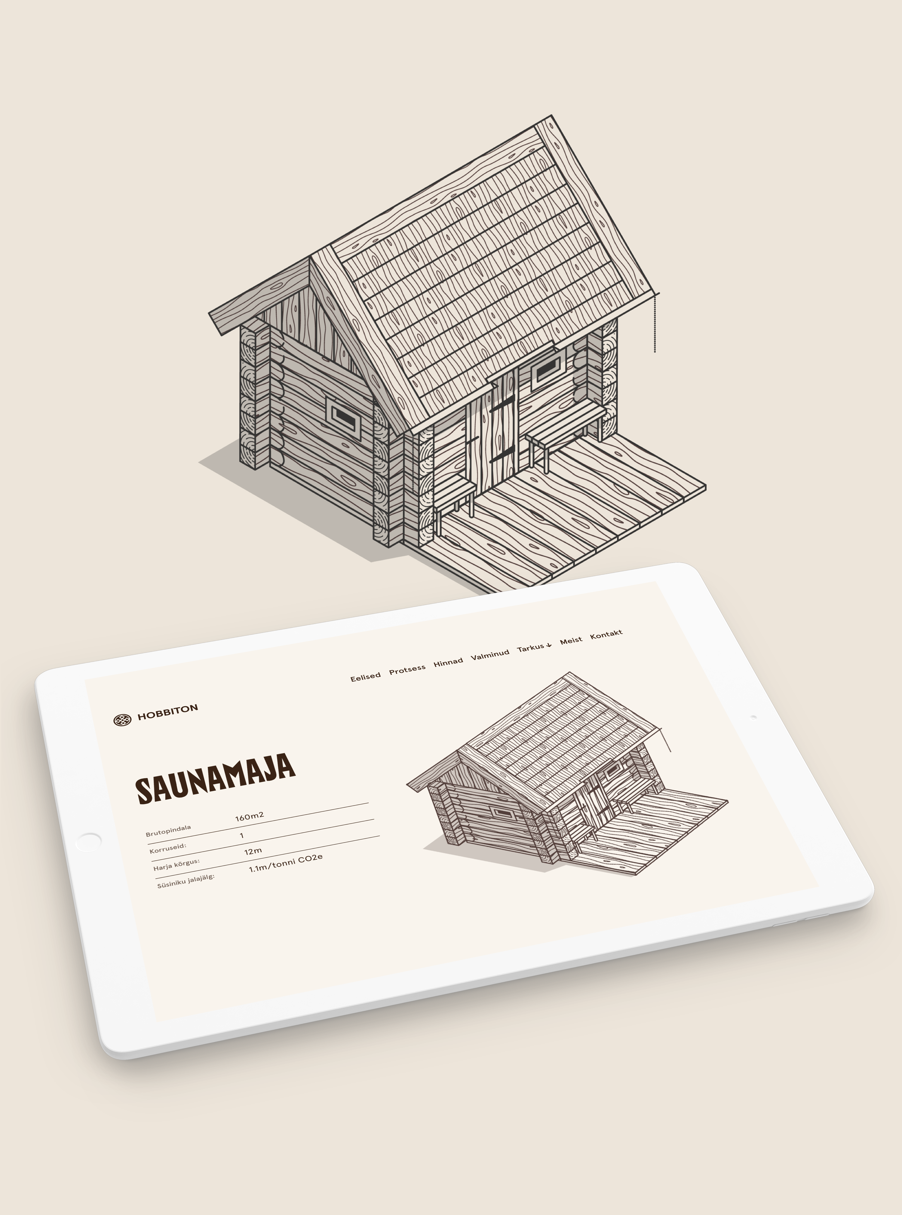
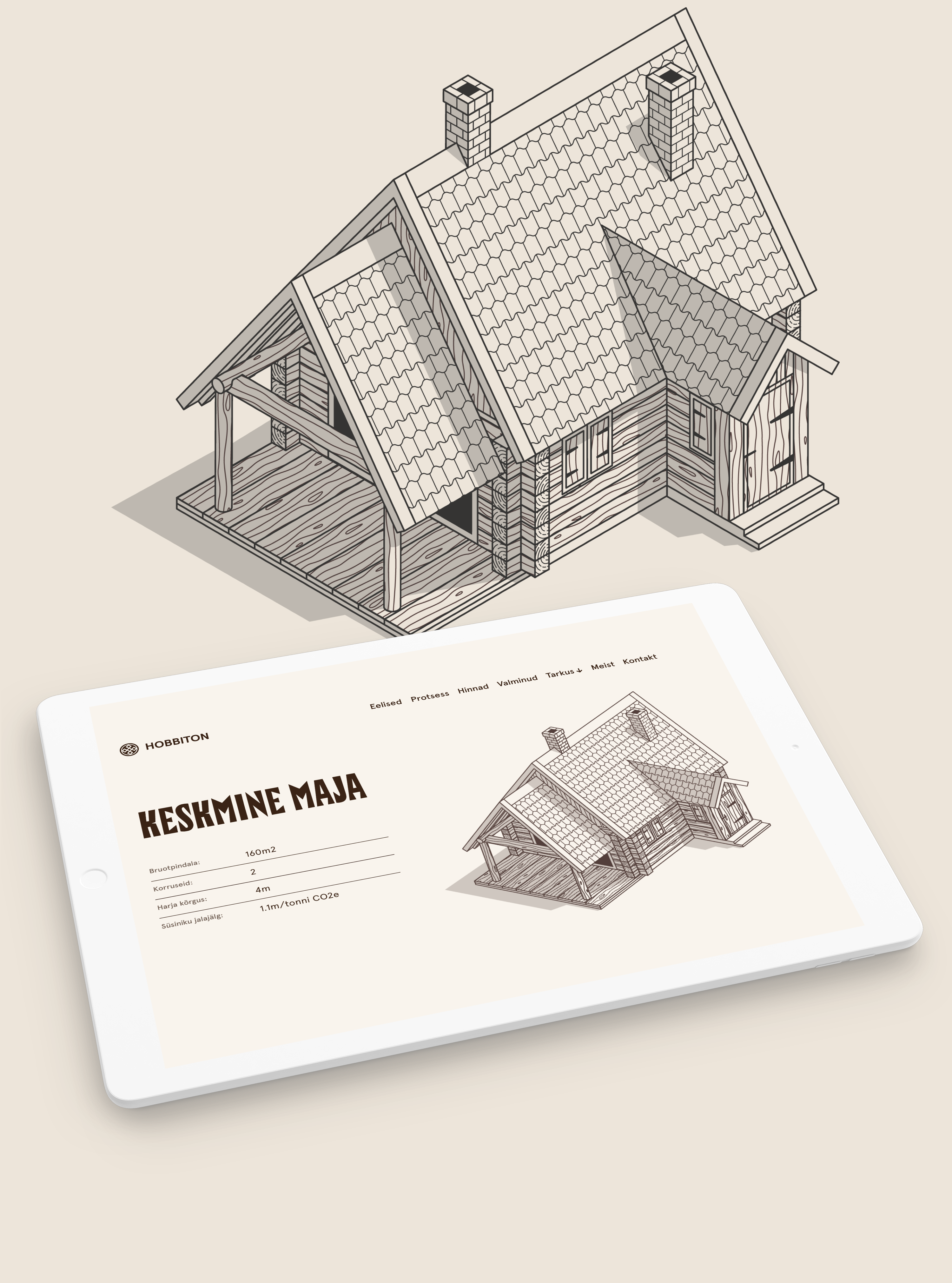
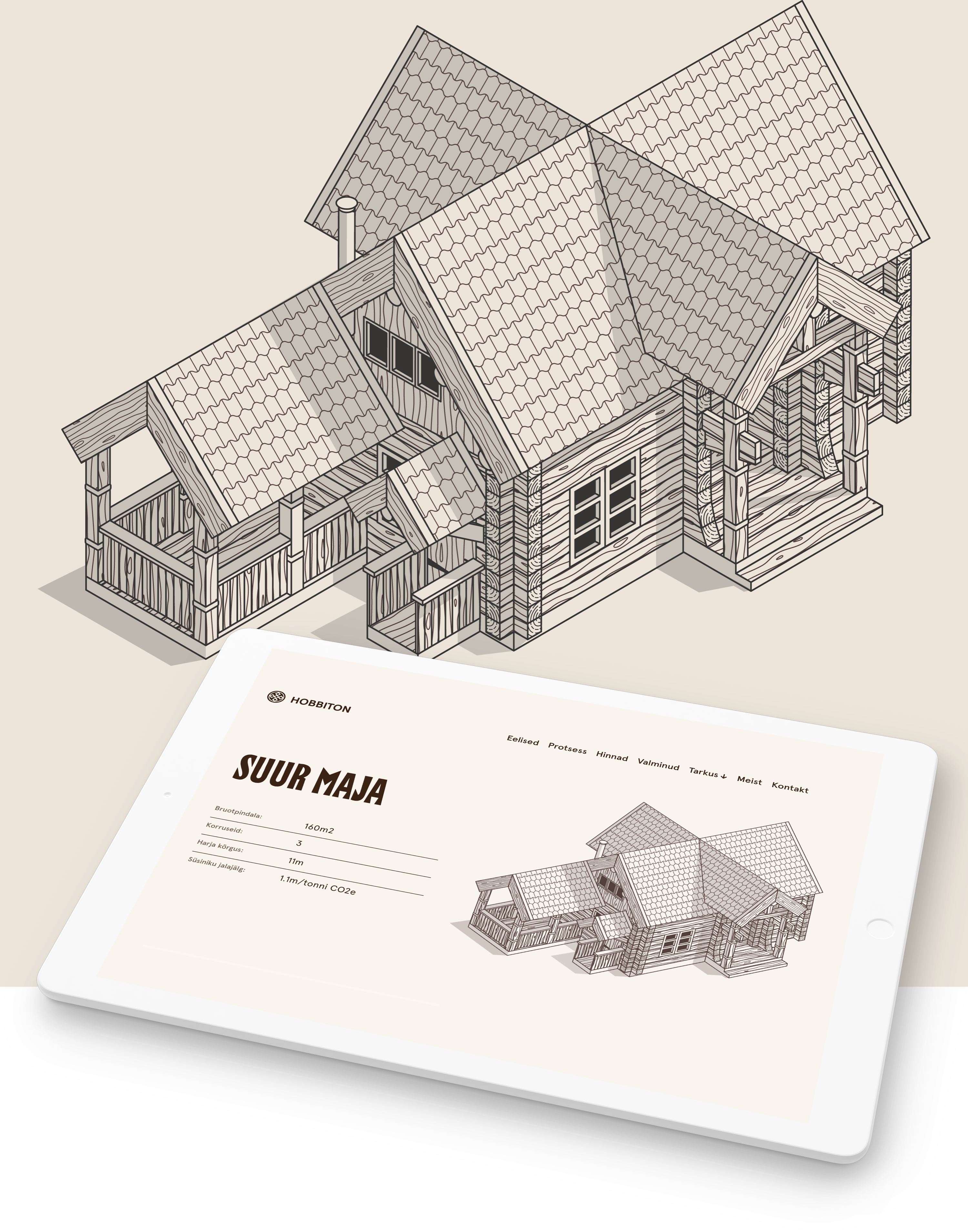
Hobbiton produces four standard size houses: the sauna, small house, mid-size house and large house that needed illustrative materials. I used some photos of the works they had done to sketch out the types of houses on an isometric grid and tried implementing the icon style to the housing.

Style

After the sketches I put together an isometric grid in illustrator and tested out some illustration directions. Just monoline, using shadows to define space, adding textures. The final version was the most complex and also the most visually interesting, so that was the style being used. I built up the rest of the illustrations of the houses on the same grid and had a coherent visualization for all the types.

Want some illustrations done for your business? Get in touch

Previous case study

Hepta Illustrations

Next case study

Typetober