0
  • Hepta Airborne
  • 2018

Design & Development of Hepta Identity

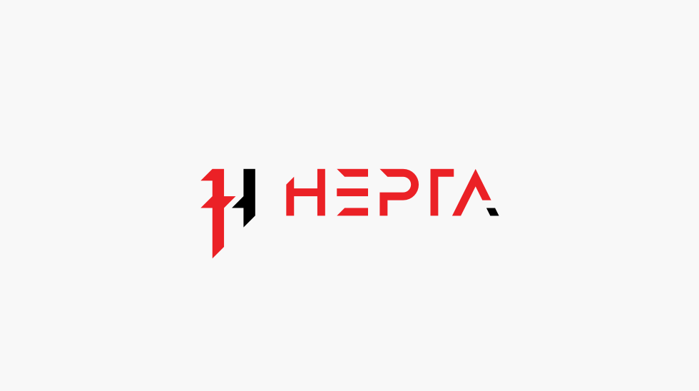
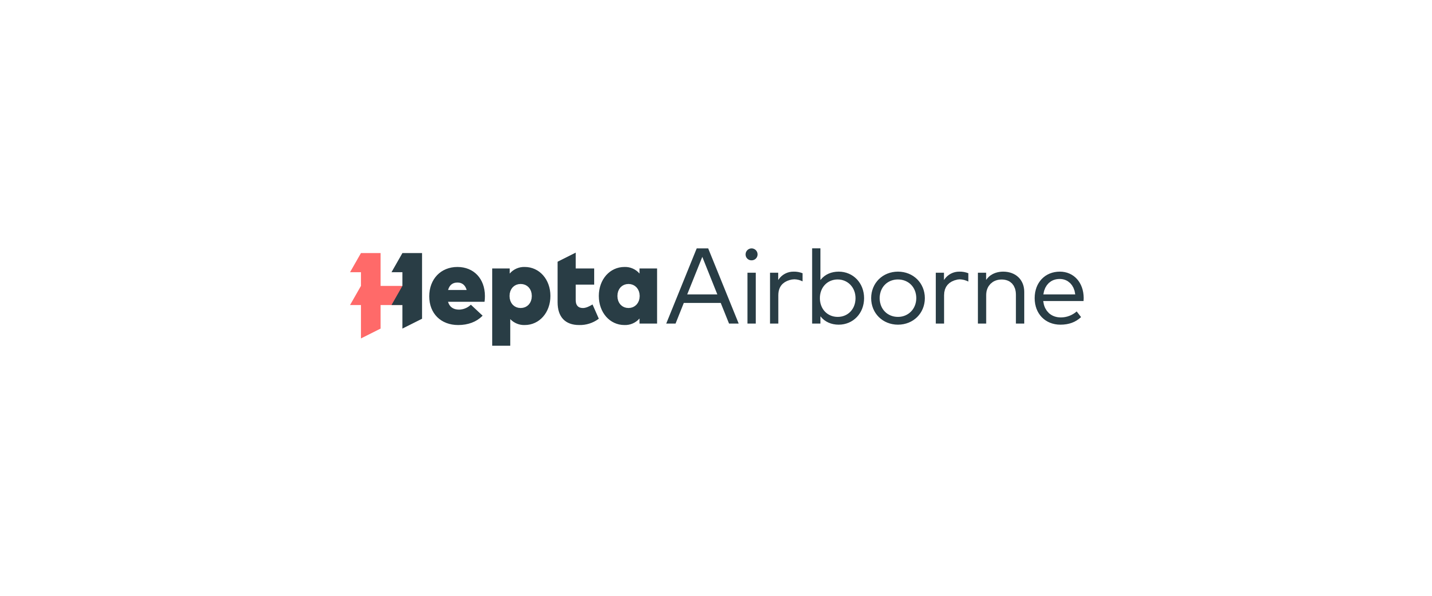
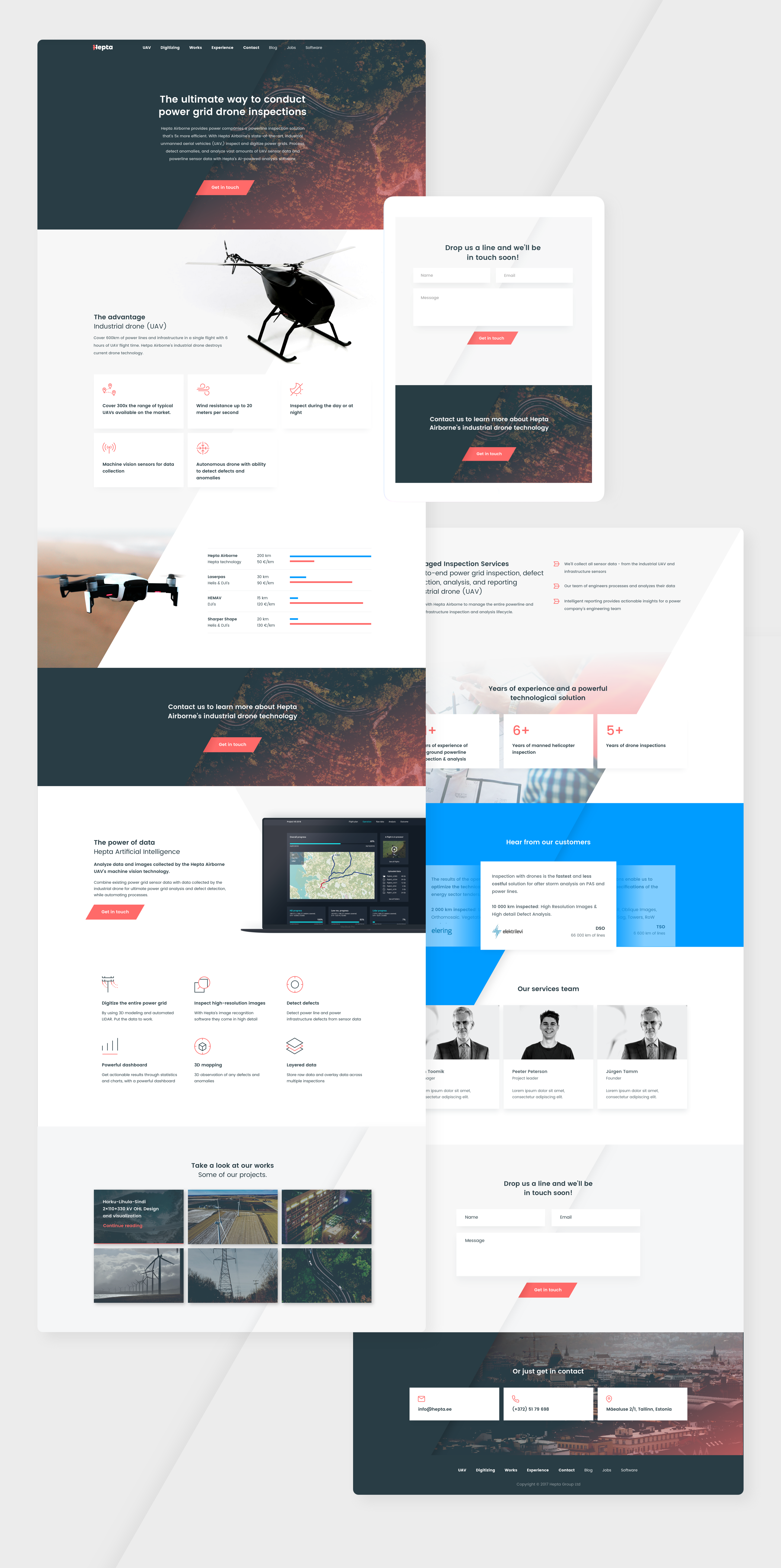
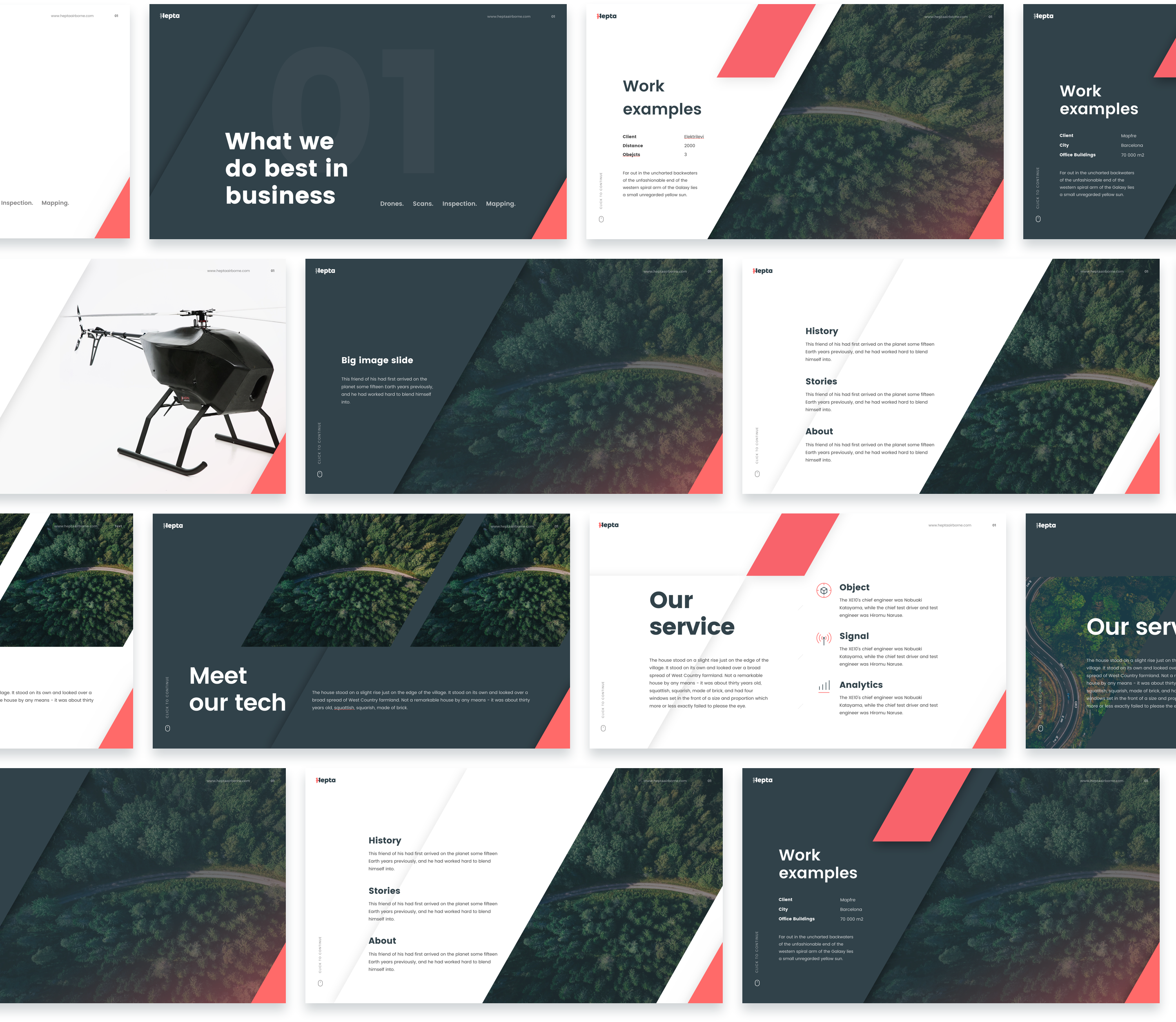
Hepta is a drone inspection and analysis provide. They operate drones that do variety of digitizations, 3D mapping and image capturing to detect any defects in power lines with their own analytics backend. They needed a refreshment of their brand and website.

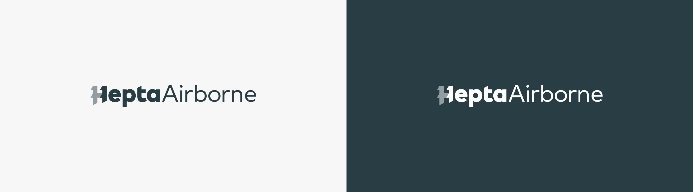
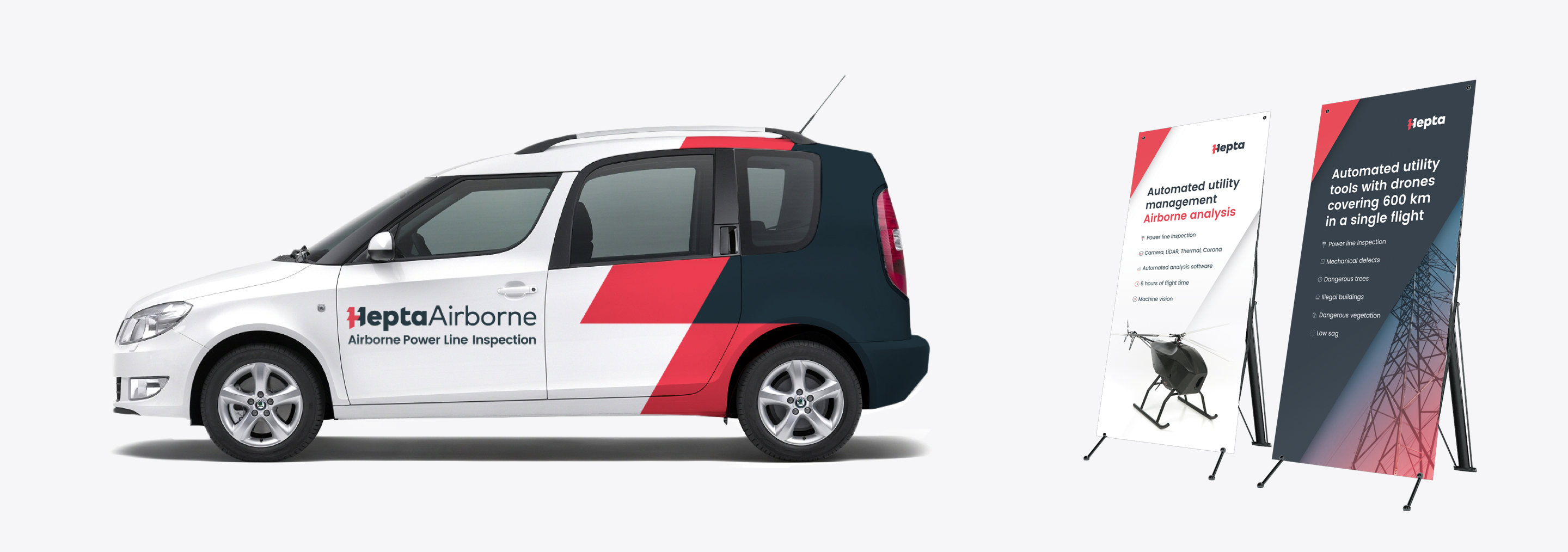
The whole process of developing a visual system took over half a year and as a result achieved a coherent B2B identity system that went across all of their digital and printed media.

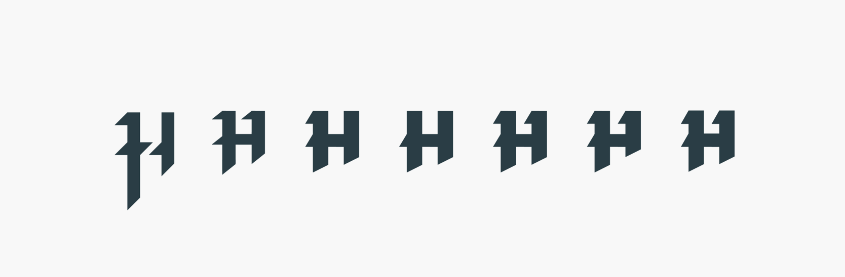
In the beginning of the branding they had their own logo mark that needed a refreshment. The exploration and development of that mark is brought out below.

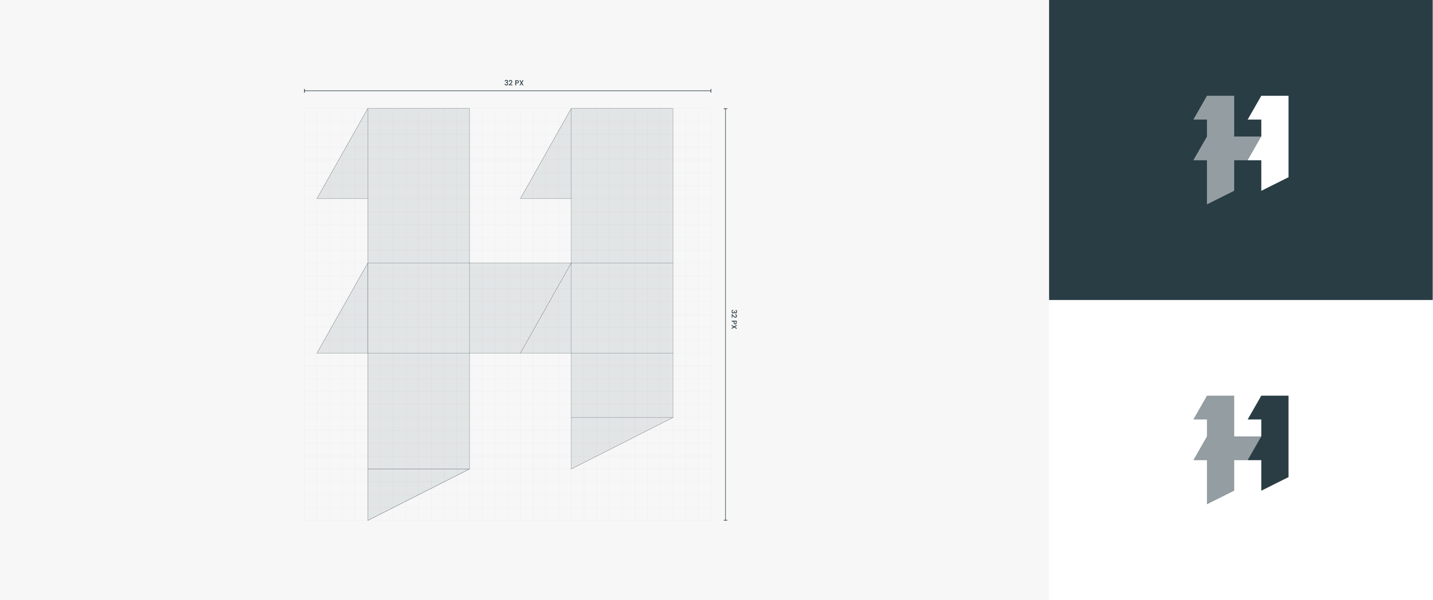
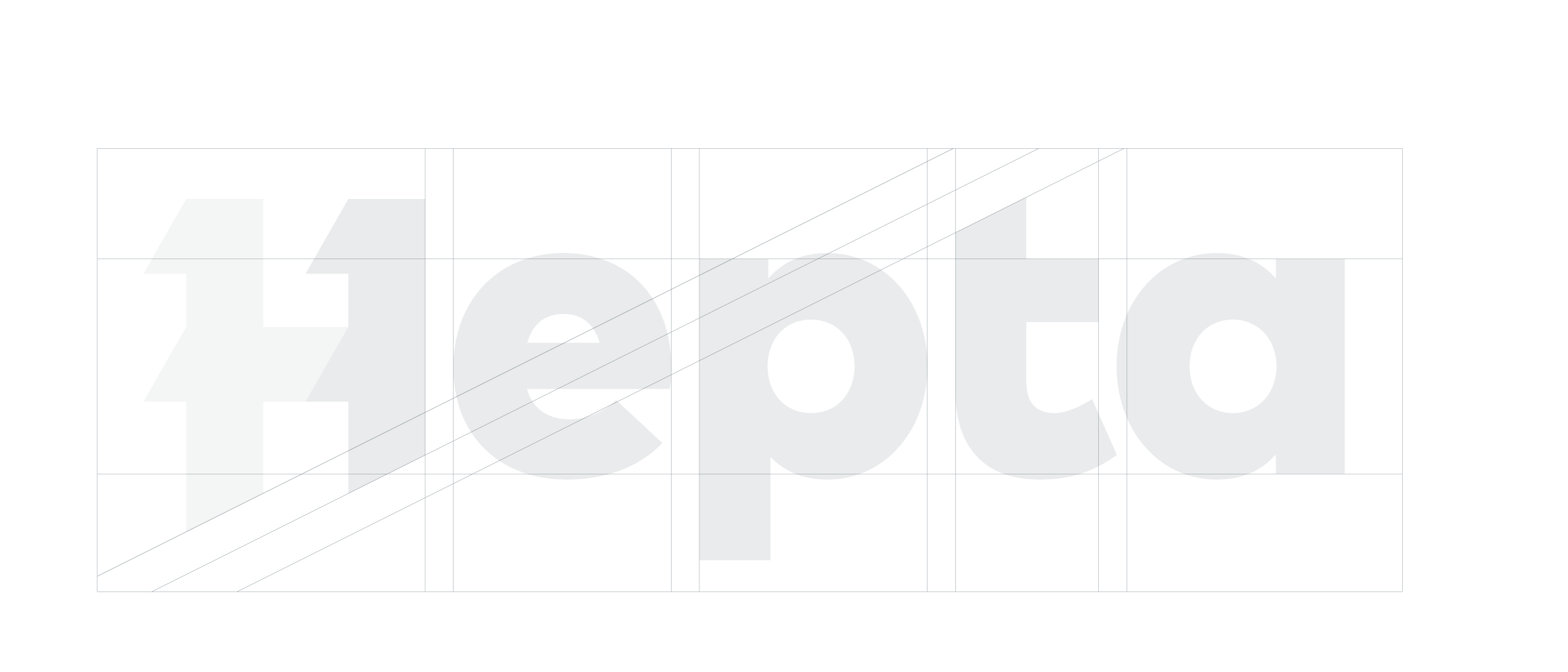
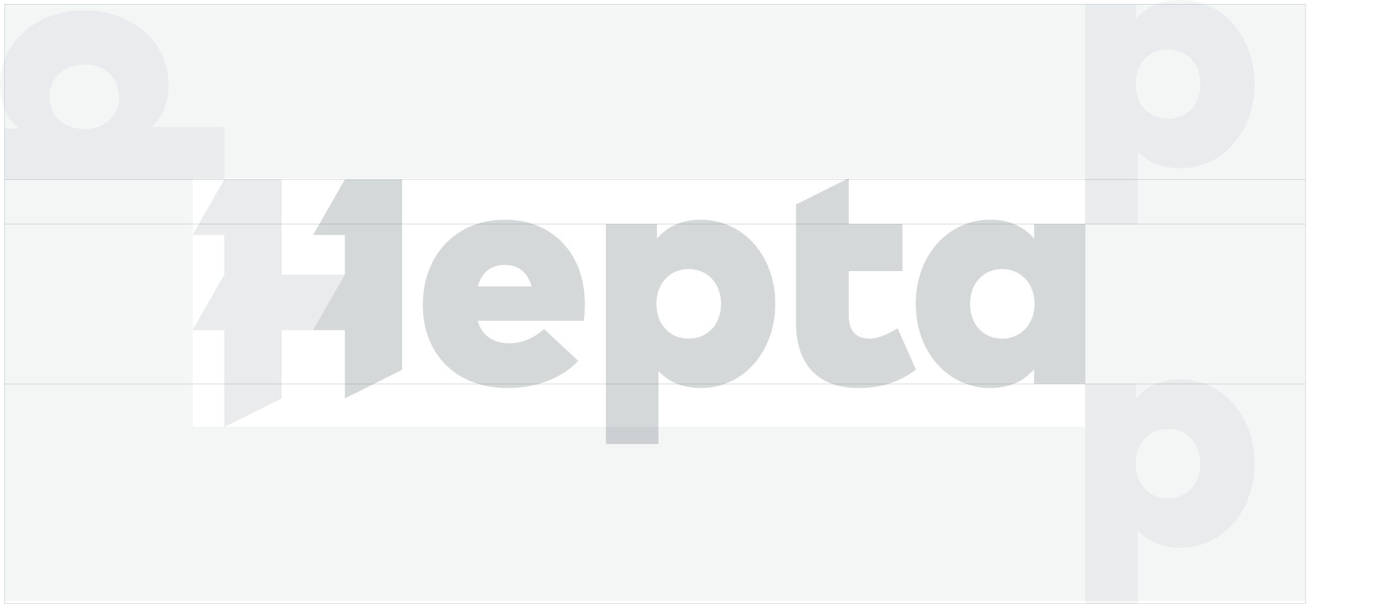
The Hepta logomark is built on a 32×32 px grid for optimal online use. Left side is set either with red or 50% opacity to separate from the rest of the mark.

Logotype

The logotype is built on geometric sans-serif typeface and contains the logomark.

There are two versions depending on where the logo will be used – Hepta and HeptaAirborne. HeptaAirborne is to be used in places where no additional context can be found or there is a lack of prior knowledge about the services Hepta offers.

Construction

The logotype is tightly kerned with a low p-descender and with a cut t-ascender. The logomark is part of the logotype, but can also be used independently. It was made to work with a popular Google Font called Poppins, which is the brand font.

Clearspace

Additional logo management includes adding p-lenty of negative space around the logo. Last letter a can be used for horizontal centering and baseline to arrange with other type.

Colors


The brand has adapted color system with focus on online colors, with two primary colors and three secondary colors.

Gradients


Big part with the visuals is the use of drop shadow and the diagonals. It is in an angle of 60 degrees and derived from the angle of the logo mark. It is used as a transition into a picture or between colors. It is used in combination with gradients and color overlays.

Web design

The website used the main branding language by incorporating the angle of the diagonals and gradients into the design. The site includes various creative uses of imagery and icons. The sites structure is simple as a one-pager with a few additional sub pages that are editable by the client.

To the website

Other media

The brand includes other assets that goes along with the identity that include: presentation templates, car vinyls, banners and other printed media inline with the identity.

Need identity done for your business? Get in touch

Previous case study

Hobbiton Illustrations

Next case study

Typetober